The energy mix powering a home
By calculating the mix of energy types powering my mums home we figure out how much of her energy comes from fossil fuels and how much comes from renewable sources.

Sam Bendat
Updated: August 20, 2024
This is the first newsletter topic that was crowd sourced by a reader emailing me.
The questions we discussed were:
What´s the actual energy mix of the electricity in my home?
What percentage is coal, solar, hydro, and wind?
Is it possible to have 100% green energy or is that just an accounting trick being sold by energy providers?
To give you the juicy bit up front, I calculated my mum's energy is really 0.35% battery power, 41.81% renewables, and 57.83% fossil fuels. But I'm gonna break it down and outline some of the pitfalls for that calculation.
What's the typical energy generation look like
To answer these questions we first need to take a look at the energy generated per hour in the National Electricity Market (NEM). For context, the NEM is a huge network that extends all of SA, VIC, TAS, ACT, NSW, and QLD, everyone uses the NEM and there are very few ways around it.
The data, below is a stacked area chart using data by OpenNEM, it shows the energy mix of the NEM for every hour of this past Sunday, September 24, 2023, from 12am right up to 11:59pm.
To read this graph, as an example we can look at 12am, furthest to the left. At this point in time fossil fuels made up around 72% of all energy generated in the NEM, battery power was less than 0.2%, and renewables made up the remaining 28% of energy generated.
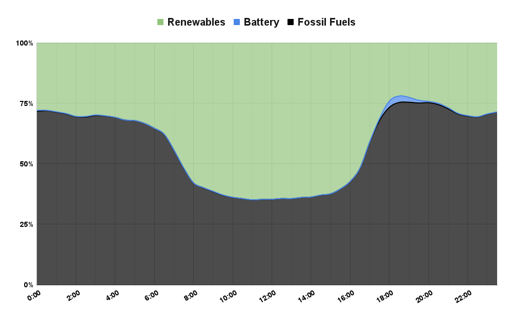
I grouped the different forms of generation together to keep it simple, renewables vs fossils. We can see in the graph that throughout the day, wind and hydro keep up a minimum renewable generation of just above 25% for the total daily mix.
We can also see the mighty Aussie sun kicking up the solar power part of the renewables at around 7am then winding down around 4pm as it begins to set.
At around 6pm a tiny bit of battery capacity kicks in to a peak of 2.7% of energy being sent into the grid.
At all other times the black section is coal and gas energy sent into the NEM.
This is a fairly typical day for the NEM. If you want to play around with the above chart, you can do so over at OpenNEM. Here's what the last seven days look like.
What's typical energy usage look like
Let's examine a typical energy usage pattern to see how it compares to the energy mix of the NEM. As an example I am going to use my mums energy usage data, which is pulled remotely straight from her energy meter.
The chart below is my mum's average energy usage by hour of the day using a full year of data.
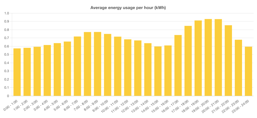
Like most people, my mum's energy spikes from around 5pm to around 10pm. She has a steady rate of usage through out the day that sits at around 600 watts per hour, or 0.6 kW.
For context, 100 watts is like running a 100-watt light bulb for one hour, at any one time she has six 100-watt light bulbs on.
Lets compare the generation vs the usage
Without having to do another fancy graph we can see from the above two graphs that the most energy-intensive hours for my mum are just after the solar generation starts to wind down.
But with a bit of Excel magic I can find some pretty cool numbers on where her energy comes from.
I took the data of the energy mix for this past Sunday with the renewables, fossil fuels, and batteries and compared that to the 30min average usage of my mums house. By breaking it down by each energy generation type we can find out how much she sources from each form of energy throughout the day, given its prevalence in that market at that exact time, and realtive to her overall usage.
My mum's energy usage by type of energy generation is:
Batteries = 0.35%
Renewables = 41.81%
Fossil Fuels = 57.83%
For Australia, that's actually not that bad. She is still pretty high in fossil fuels, but the late morning and afternoon boost of solar energy is working hard to bring down her dependency on fossil fuels.
But wait! My energy provider is green?
It's true that some energy providers out there are greener than others. But for most of the providers, it really just comes down to some creative marketing and morals.
I'm definitely not an expert on backroom energy deals but I can confidently say the NEM is where the energy comes from, and the NEM is not 100% renewable. What really happens when a provider claims to be 100% green or sourcing 100% renewables is in fact a bit of accounting wizardry.
Since the NEM is unavoidable, the only other way is to generate and purchase energy contracts from renewable sources to cover the fossil fuel energy that was used from the NEM to power your house then say, "we the energy provider, have sold you 100% green energy, in a roundabout, not direct way..."
In truth, the energy in your home still comes from fossil fuels.
Your provider can try and encourage more renewables by purchasing renewable contracts but it's hard to say how much purchasing they're really doing and who with.
The only way around NEM fossil fuels is to have a battery in your home that is directly linked to your house, and cut the NEM out as much as you can, but that's a whole new can of worms.
What did I gloss over...?
The data I used about the NEM isn't fit for purpose and I generalised it a bit. In reality, a photon hitting a solar panel in Carins is not going to power a home in Hobart and vice versa. There's a lot of complexity to a huge energy market and how energy is distributed.
Though overall as a country we still have a long way to go before we hit 100% renewables.
If it's of interest to you, I could try and interview someone who works in the NEM to help clarify more information about how our home energy works?